Instagram Wordmark Gets a New Look After 10 Years
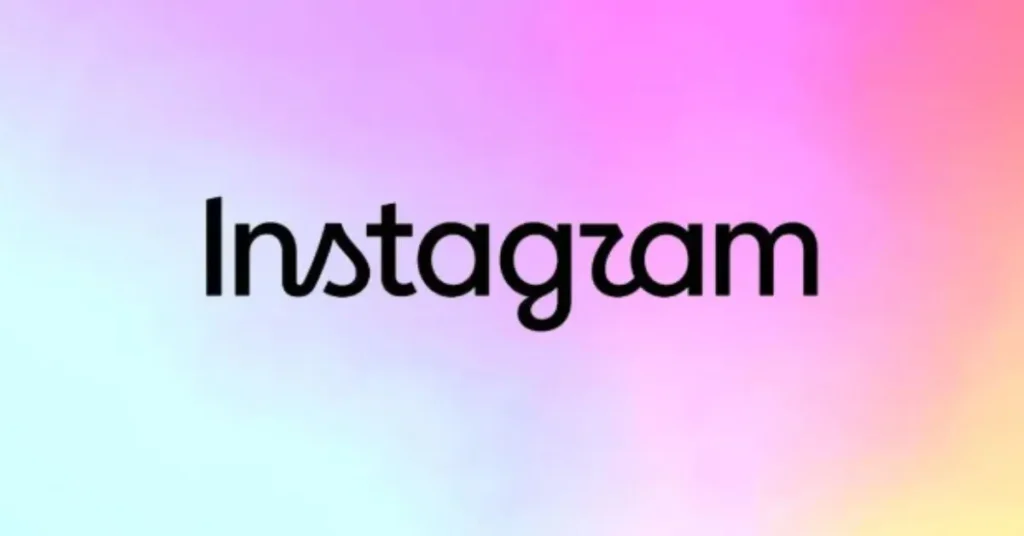
Instagram has refreshed its Instagram Wordmark for the first time in about a decade. Announced on August 13, 2026, the update gives the familiar wordmark a sharper and more modern appearance while keeping its recognizable visual character.
The update is part of a bigger change to the way Instagram looks, which includes changes to the font and the way its signature colour scheme is used. But the familiar Instagram app icon will stay the same as part of this wordmark update.
Key Highlights
- Instagram refreshed its Instagram Wordmark for the first time in about 10 years.
- The new design has cleaner, bolder, and more refined lettering while keeping the familiar script style.
- The Instagram app icon remains unchanged with this update.
- The refresh is part of a broader update to Instagram’s brand identity, typography, and visual style.
- The change is mainly visual and does not affect how Instagram works for everyday users.
Table of Contents
What Changed in the Instagram Wordmark?
The new Instagram Wordmark Logo is similar to the old one, with its handwritten and script-inspired style, but looks neater and more compact. Some letters, including the “s”, “r” and “g”, have more noticeable curves than the previous design.
Instead of completely changing its look, Instagram has made small improvements to its current design. The aim is to design a wordmark that feels more modern but is still easy for users to recognise.
Instagram’s First Wordmark Update in 10 Years
The latest update is important because it comes after nearly 10 years. The last time Instagram changed its look was in 2016, when it started using gradient-based branding, which we now all know and love.
Since then, Instagram has grown from a photo-sharing app into a platform for creators, video, messaging, communities, and digital expression. The 2026 wordmark refresh shows how the brand is changing while staying connected to the brand users already know.
Why Did Instagram Update Its Wordmark?
The latest update comes nearly 10 years after Instagram’s last major visual change in 2016, when it introduced its familiar gradient-based camera icon.
Since then, Instagram has grown beyond photo sharing into a platform for creators, video, messaging, and communities. The 2026 Instagram wordmark update reflects this evolution with cleaner, sharper lettering while keeping the brand recognizable.
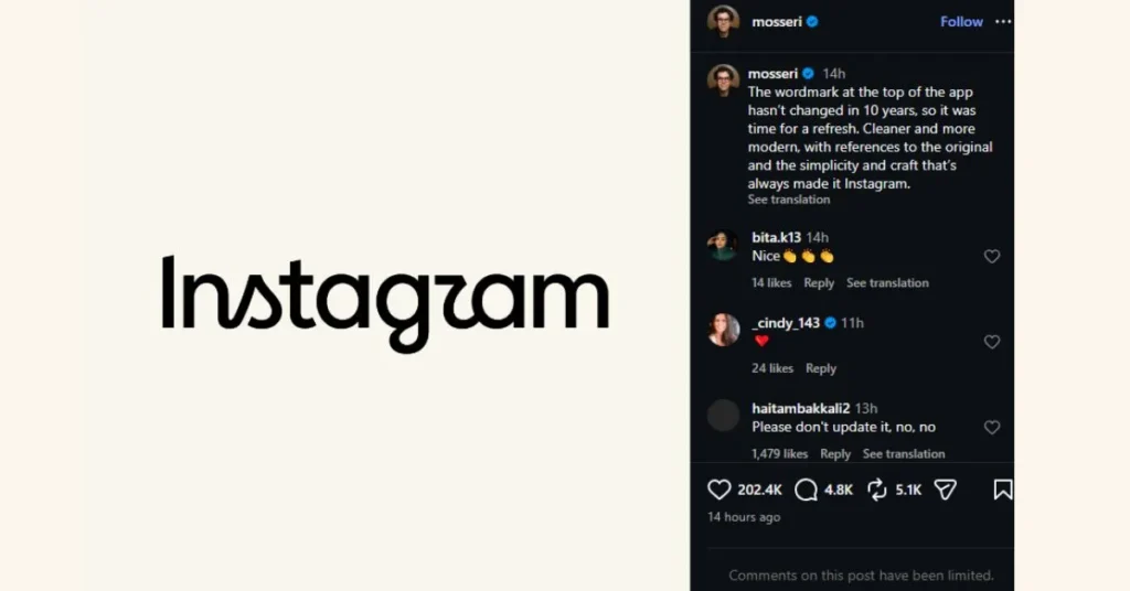
According to Adam Mosseri, the refreshed wordmark aims to feel more modern while still referencing Instagram’s original design and simplicity.
Instagram Wordmark vs. Old Design
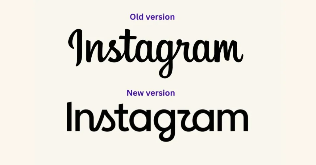
The biggest difference is in the lettering.
The old wordmark looked more traditional and written in cursive, while the new version has bolder and more compact lettering with refined curves. These changes make the wordmark look slightly different but still easily associated with Instagram.
The overall approach is subtle: it’s recognizable enough to feel familiar, but different enough to signal a new chapter for the brand.
Why Did Instagram Update Its Brand Identity?
The way Instagram looks has changed as the platform has grown. There are more creators, content formats and ways for people to connect. So the company wanted its branding to better represent this wider experience. Meta explains that the refreshed identity is designed around creativity, connection and self-expression.
The latest refresh is all about creativity, connection and self-expression. Instead of completely changing its look, Instagram has taken a step-by-step approach by updating the design in a way that is familiar to users.
What Does the Instagram Logo Change Mean for Users?
For everyday users, there is no major change to how Instagram works. The update is primarily a visual branding change, not a major redesign of the app.
The updated logo and other brand elements will appear across all of Instagram’s platforms over time. The app icon doesn’t change as part of this update.
Instagram has also updated its typography system, including Instagram Sans, and introduced typefaces such as Instagram Pen and Instagram Mono. The brand’s signature gradient is still there, but it’s being used more flexibly.
For everyday users, there is no major change to how Instagram works. The update is primarily a visual branding change, not a major redesign of the app. For creators and businesses using Instagram, other platform changes can also affect how content performs and reaches audiences.
User Reactions to the New Design
People have had different opinions about the new Instagram logo. Some users like the cleaner and more modern look, but others have questioned some of the changes to the lettering.
Some users have even joked that the new logo looks like the Instagzam logo, especially because of the new “r”. The mixed response shows how strongly people can react when a familiar brand changes its look.
Conclusion
The latest update to Instagram’s branding is more of an evolution than a complete redesign. After almost 10 years, the company has updated its Instagram Wordmark. It has a cleaner and bolder look, but it still looks like the old one.
The app icon looks the same, but the updated logo, font and other visual elements show how Instagram is trying to look more modern as it moves forward.
FAQs
1. Did Instagram change its logo in 2026?
Instagram refreshed its wordmark in 2026, marking its first major wordmark update in about 10 years. The app icon itself remains unchanged.
2. What changed in the Instagram wordmark?
The new wordmark features refined lettering with a bolder, more compact appearance and additional script-inspired curves.
3. Why did Instagram update its wordmark?
The update is part of a broader effort to modernize Instagram’s visual identity and better represent creativity, connection, and self-expression.
4. Is the Instagram app icon changing?
No. The familiar Instagram app icon remains unchanged as part of the current wordmark update.
5. Does the new Instagram wordmark change how the app works?
No. The wordmark update is primarily a visual branding change and does not represent a major change to Instagram’s core functionality.